
Session 4 - Decoding Advertising

|

|

|

|
Roland Barthes: Panzani Advertisement
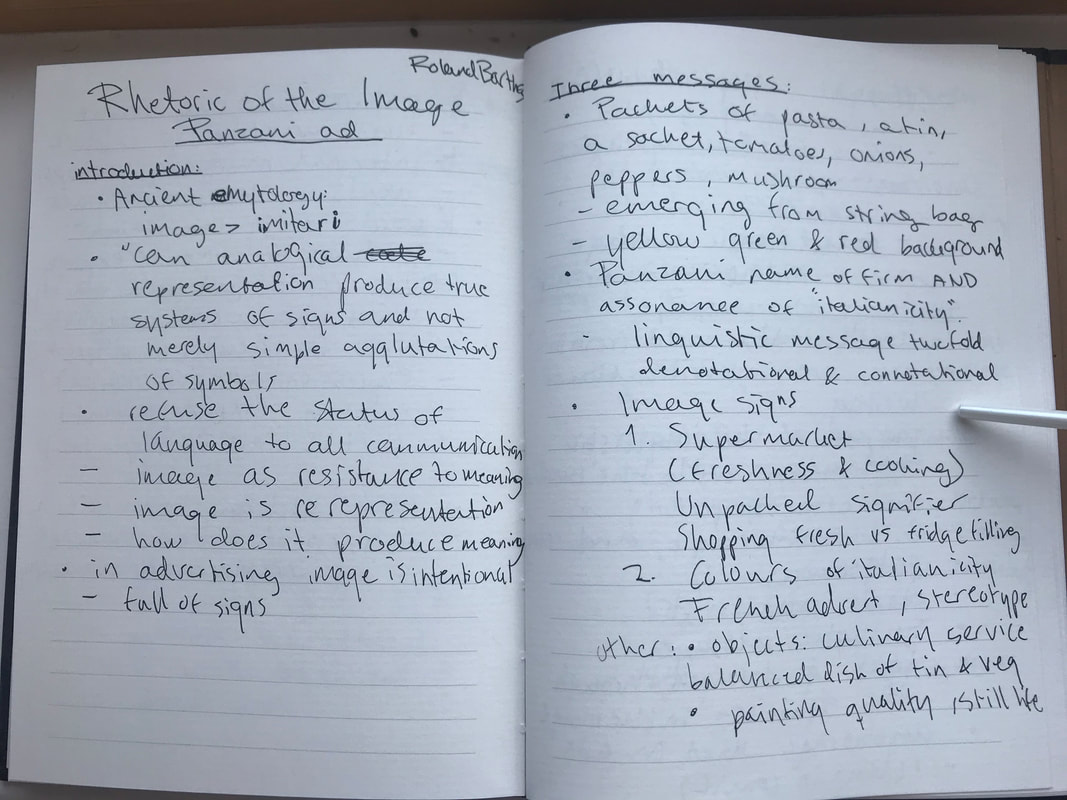
In Barthes The Rhetoric of the Image from Image, Music, Text Barthes analyses a French Panzani advert to give light to the different signs and analysing it. We also analysed it in our lecture which you can see in the images above. Barthes starts off by talking about the denotations and non coded signs of the image, what exactly we are seeing. We are seeing things we would typically see in an italian pasta meal, like pasta, a tin, a sachet, some vegetables like tomatoes, peppers, onions and mushrooms. This is all spilling out of a net and accompanied by yellow green and red colours and background. The name of the brand being advertised is Panzani, which Barthes argues also gives an assonance of "Italianicity". Thus the language is both denotative and connotative. We also get signified fresh values and home cooking, from signifiers like the netting bag spilling open "unpacking" the product. This plays on the myth of our culture where individual shopping is opposed to filling up the freezers and fridge. The colours in the image is also very significant, like the yellow greens and reds giving connotations of this same "Italianicity". It isn't made by Italians however as it rather plays of French stereotypes and perceptions of the Italian culture. Some other few signs Barthes notices is how it seems like a culinary servcie from the mix of tin and vegetables, and the resemblance it has to still life paintings. All of this together does require some coded cultural and artistic knowledge (Barthes, 1977, p. 152-154). This still life also comes into play with the spontaneous composition of the image, how everything just spills out but is perfectly laid out in an aesthetic manner (Barthes, 1977, p. 159).
When it comes to the text he points out that there appears to be two linguistic functions in relation to the twofold denotations and connotations, namely anchorage and relay which i covered in the previous session. In addition the image is polysemous, which has underlying signifiers and signifieds, and we are able to pick and chose which we want. The text on the ad replies specifically to what the advert is, and helps us identify the different denoted elements and signs. Anchorage is the most used function in a linguistic text and is common in such advertisements. Relaying is much less common but is used in comics. Here the text and image can stand in a complimentary position and together creates a higher understanding. I believe this advert to be interdependent, where the brand uses the fresh vegetables and the colours to speak of the products they are wanting to sell (Barthes, 1977, p. 154-157).
Barthes, R. (1977) Image, Music, Text. London: Fontana.
|

|

|
Analysis practice: TUI Advertisement
|
For this practice I have chosen an advertisement by TUI which i found in the magazine Cosmopolitan, March 2020 edition.
Image Non-Coded: It is a very fresh image, with a bunch of blue colours and hues, like the intense blue water at the bottom and the cloudless sky at the top. The slides we see as the centre ground of this picture is also blue and white. We can see the slides also twirl around in a whirlpool at the far right. Perhaps the most striking in the image are the two kids just about to dive into the water below as they are coming out of the slide. It is an exciting image with a lot of dynamics. Their brown hues compliment the blue. We also have a touch of green lush trees and grass in the far back, where we see a hedge and some trees. Coded: There are a lot of holiday signifiers in this image. One of the first thing we notice is blue, and it is very striking. It is a good colour to use for a tranquil, chill and freshening image. It also gives connotations of weather, and during march when this ad was presented it can be very cold and maybe gloomy in the UK. So clear blue skies really draw you in and convince you of this paradise signifier. This is further amplified by the green palm trees in the background. There are also slides. Slides are a sign any kid dreams of seeing. It means excitement and fun, and is usually advertised as a kid oriented activity. This is further supported by the two kids coming out of the slide with a body language that screams joy. This movement is as i said also quite dynamic, and almost looks like a spontaneous action. It is a good example of studied spontaneity, and since this is a picture advert it has been carefully composed (Barthes, 1977, p. 45). There is also a good structure in the image. The slides are the main thing leading our eyes around the image. Our eyes have a natural tendency to follow a shape like this to where it ends, it is the same with stairs. We migt first notice the striking red colours and the TUI logo in the top right. Then our eyes will go to the slogan in the middle, and as the slide continues to make our eyes follow it downwards to the left, where we are greeted with more text to capture our attention. This overall gives the image a good hierarchy of direction which starts in the top left and ends in the bottom right. Text Non-Coded: In the top right there is the we see the TUI logo in bold red and white. We get the title of the advert in the top middle of the advert, embellished with a dark blue text around it which say "playtime, all the time" (TUI, 2020). This is one of the first things the advert wants us to see as it is the title. We are then drawn into the bottom left with "100s of Family Hotels" in bold blue text (TUI, 2020). We are then followed up with some interesting promises like splash parks and expert run swimming lessons. We then end that box off with their slogan "We cross the T's, dot the I's and put U in the middle" (TUI, 2020). At the bottom we see some more informational text and some logos attached to TUI, and it isn't a part of the image. Coded: The title "playtime, all the time" (TUI, 2020) really strikes me as being something focusing more on kids as it's target consumer. I think the average middle aged parent would be more interested in relaxing and taking a load off while on holiday instead of participating in playtime. This promise of constant fun again. Not only is it playtime, but it is playtime ALL THE TIME. Kids tend to get very bored fast, and being able to constantly go on slides is a promising offer. We do have something small to redeem this advert for the parent audience as well however, with expert-run swimming lessons, which is something they would see as maybe something more practical and worth while. Their slogan is something a lot of customers already know of and it really closes off the advert in a simple way. Barthes, R. (1977) Image, Music, Text. London: Fontana. Fig. 2 TUI (2020) Playtime, All The Time [Advertisement] in Hearst Communications (2020) Cosmopolitan (March), p. 6 |

Figure 2. TUI (2020) Playtime, All The Time [Advertisement]
|