Brief 02 - Image & Type
Part 2
I have started designing thumbnails for the 2021 Penguin Book competition, where I have picked to design for Life Isn't All Ha ha Hee hee by Meera Syal, and The Uninhabitable Earth: A Story of the Future by David Wallace-Wells.
Final work
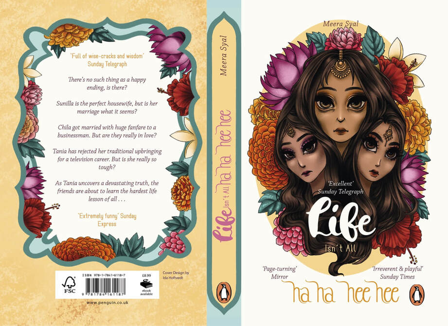
Spreads w/ bleed
Cover w/o bleed
Final drawings w/o type
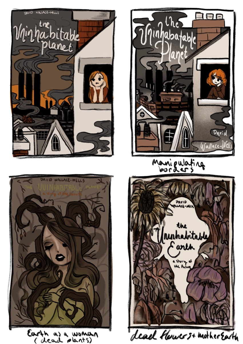
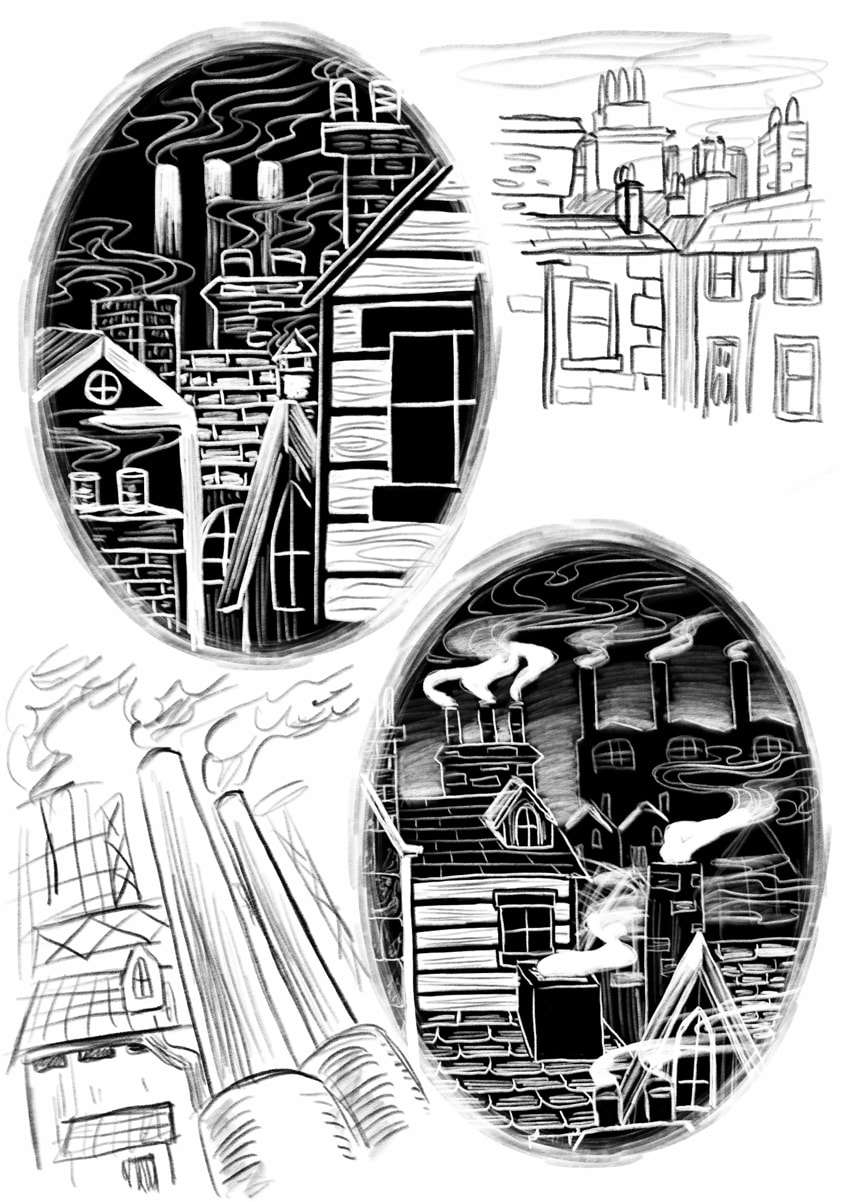
This first design was spec work for The Uninhabitable Earth: A Story of the Future by David Wallace-Wells. It was difficult for me to chose between the city scape drawing with all the chimneys and smoke and the more Mother Earth type figure. I had went ahead with the cityscape and started outlining it, but it didn't sit right with me. It didn't feel on brand for me, and I don't think it would fit quite right in on my portfolio. So in the end I went for Mother Earth as a damsel entangled in dead trees, roots and plants.
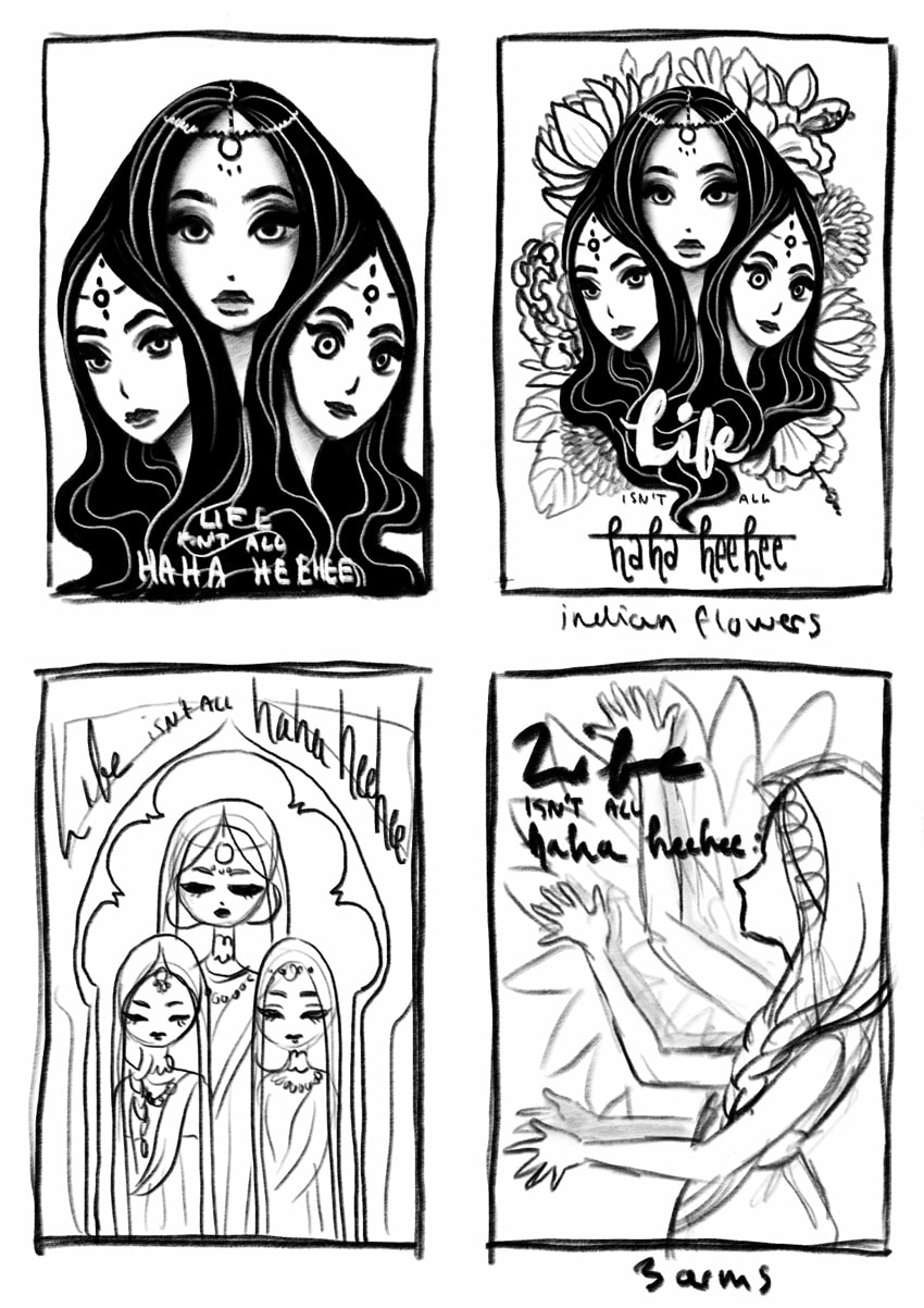
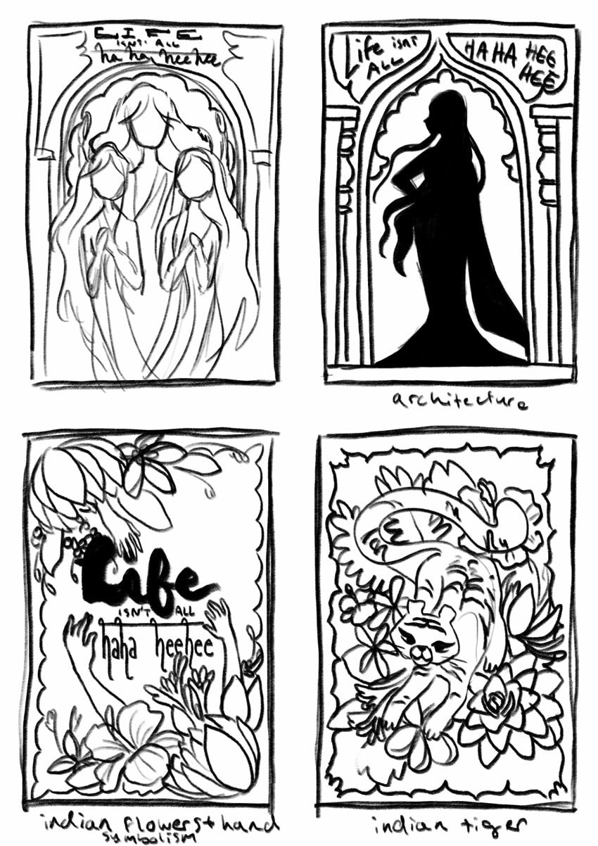
This second one is for the book Life Isn't All Ha Ha Hee Hee by Meera Syal. I struggled finding concepts and choosing which one I wanted for this book, as I was trying to bend it to fit the work I had already done. After some feedback I realised that would be difficult, and decided to bring home the personal element in the linework and style rather than the colour profile. For the design concepts I wanted to make something more symbolic, and since the book emphasised on their linked souls/ destinies and their lives I joined their hair together as one being. I also researched into Indian and Indo-western culture. I went with a Maang Tikka headpiece and some native Indian flowers, because a main element tying them to a common event was their marriages, and how none of them are quite happy with their situation. Tania (left) having rejected the marriage, Sunita (middle) who is growing tired of her role as a housewife and marriage, and Chila (right) who was initially happy but her husband is not too interested in her.
Initial Thumbnailing/ Final ideas
Inspiration
Part 1
As part of a larger task, this small 1 week exercise was to get us comfortable with different types of type usage, and how it is important for us as illustrators to learn how to implement them well with our art. This is something I struggle a lot with so this brief will help me further develop my experiments. For this I incorporated the colour red as the eye-catcher. I went for the themes horror and historical drama.


